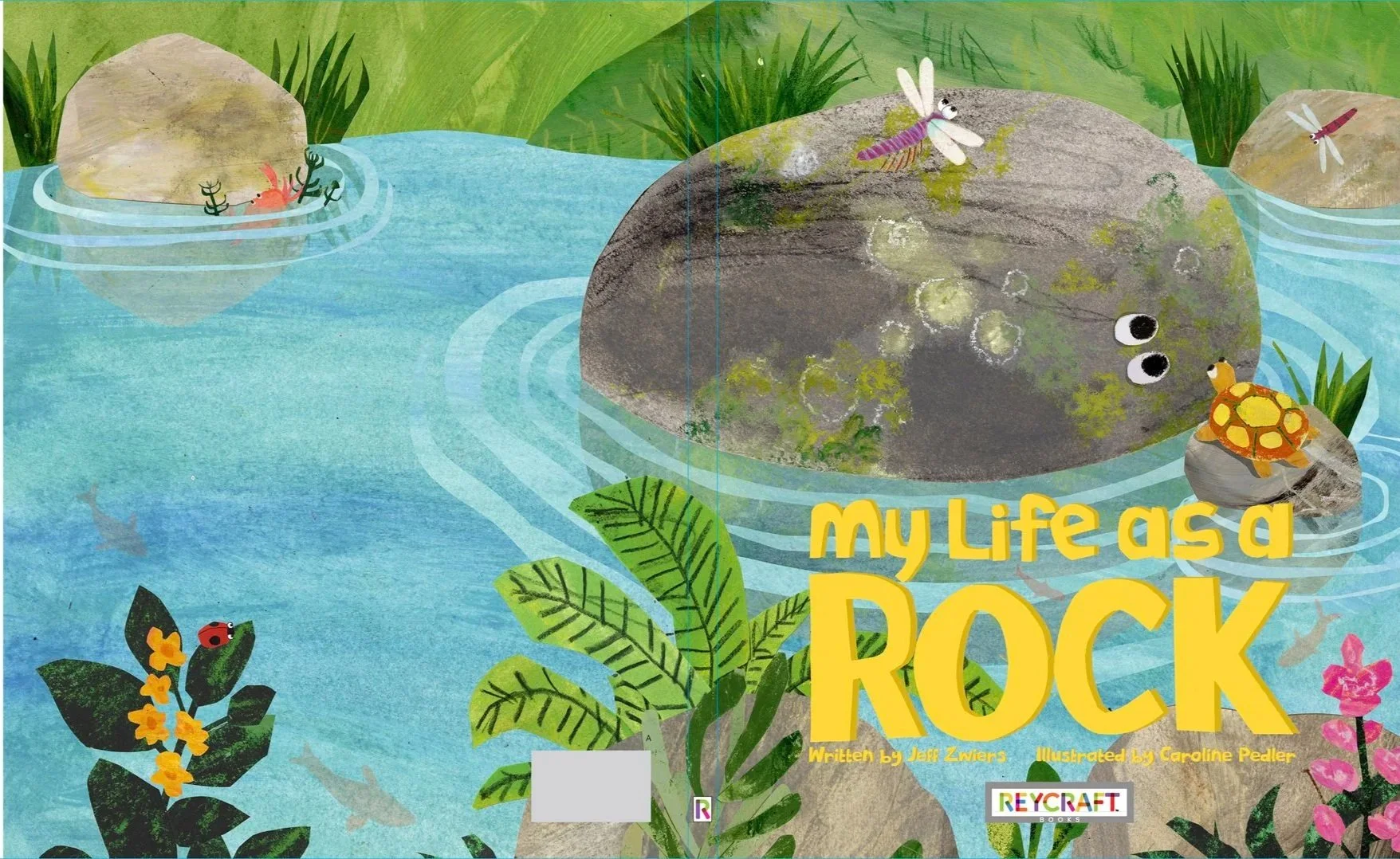
My Life As A Rock out soon, is full of hand-made textures! Nothing is digital except the composition. I wanted to share a little of the process as we come up to the publication day on 10th March 2026.
Initial inspiration
First character sketch
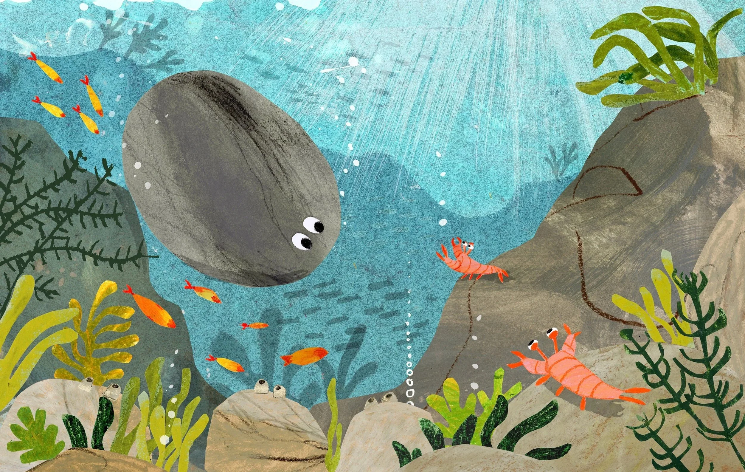
As soon as I got the brief and the story from Reycraft I started playing with the character, the rock, using some paint scruffs I had from a recent residency and publication I had completed about rocks! from Helman Tor near Bodmin in Cornwall. It was so perfectly timed.
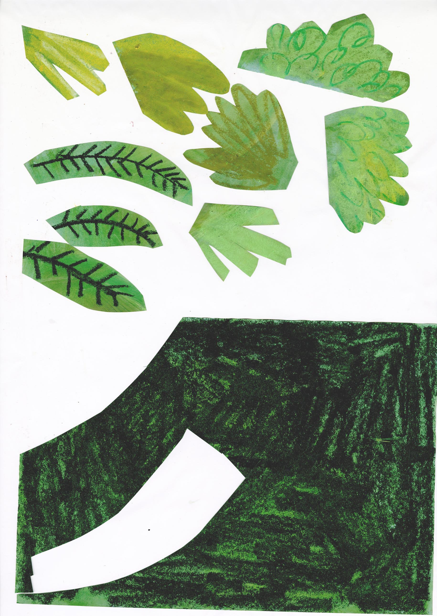
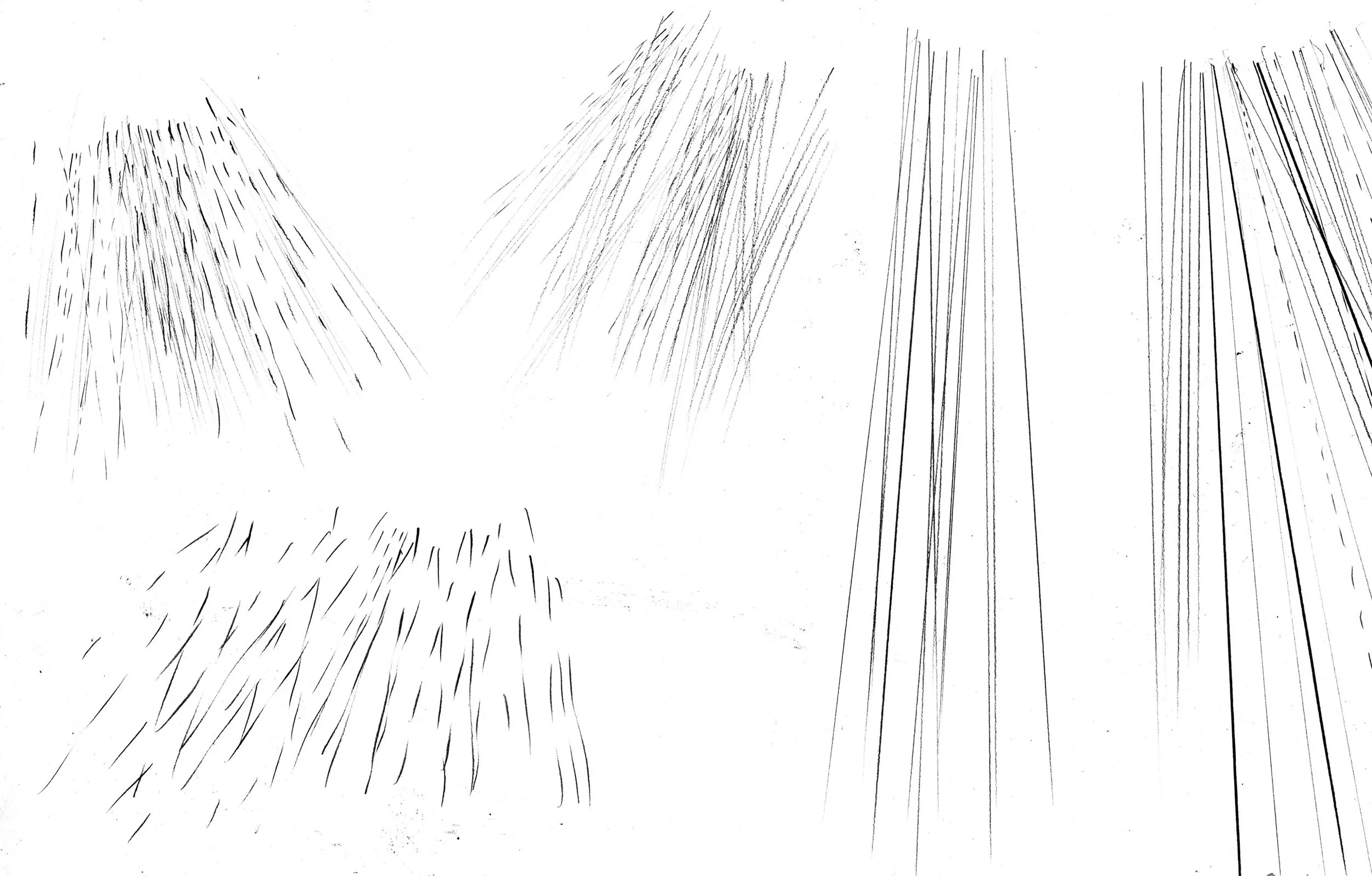
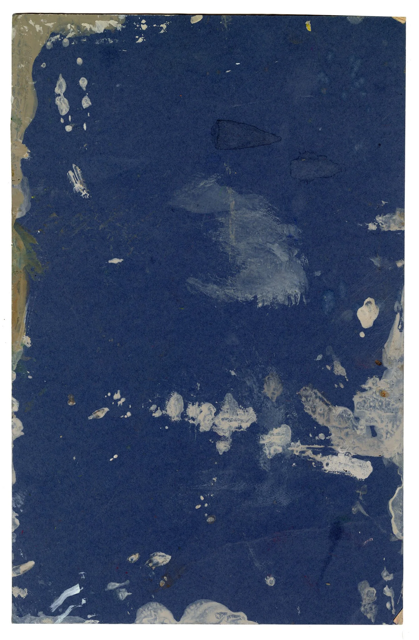
I got the character straight away and after Amy (my agent) gave me the ok, I started working on the thumbnail sketches, working them all up into a grid, (just a couple shown here) ready to send Billy and Todd. They had no edits, so I went on to make the artworks, making loads of scruffs of relevant textures needed for each page. I had so much fun with this book, it felt so nice to get stuck into scruffing paint around, making pages of textures and details for the rain for eg. and cutting shapes out and scanning them all in in my Epsom Expression 12000 scanner. I scanned everything at 600dpi as they needed them at that resolution. So the files were huge. I loved the whole process and it just felt so easy, which made me feel uneasy because I have always had edits in the past, but actually it all worked really well with my first attempt, so I am very excited to see the final book in print.
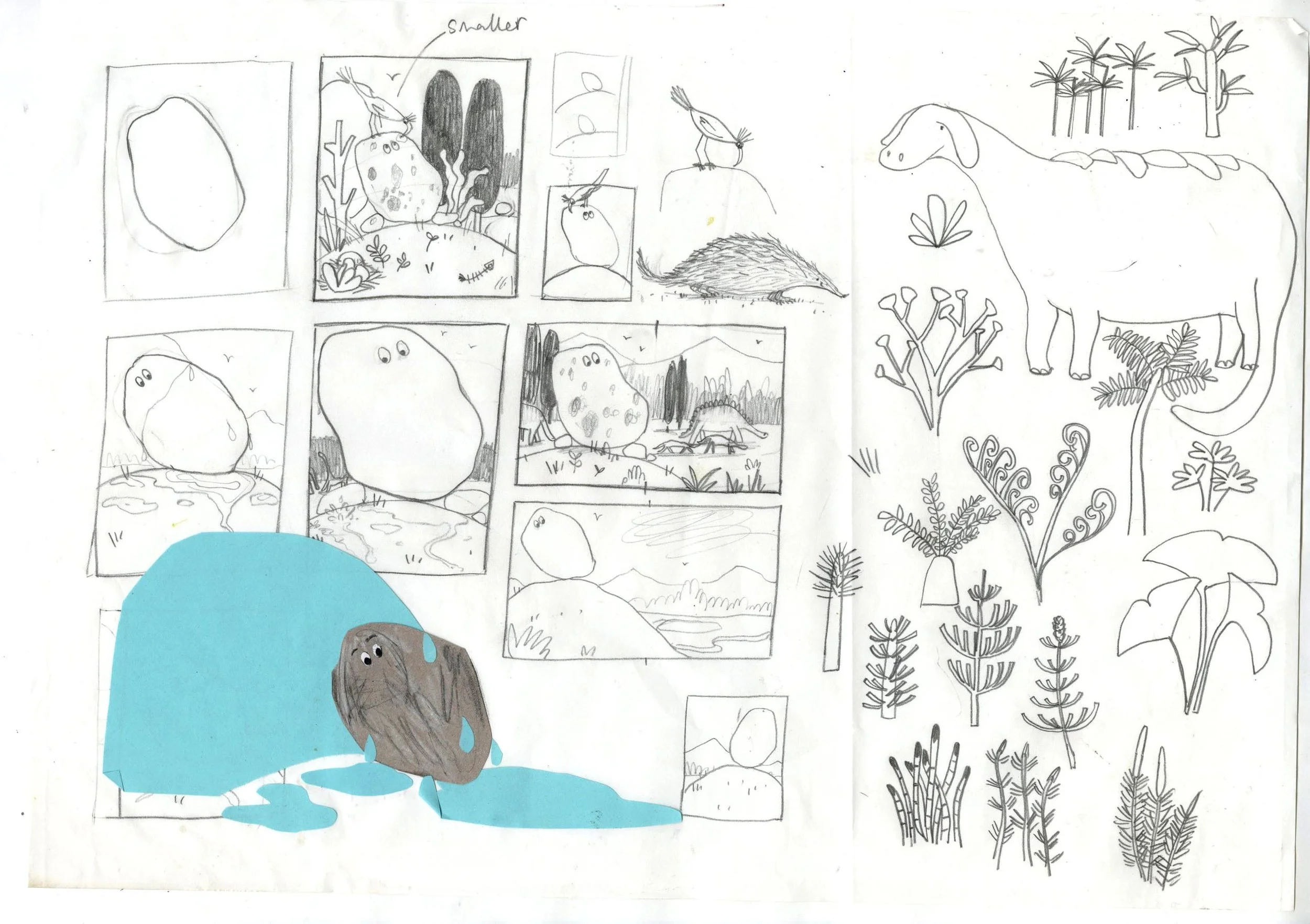
First thumbnail sketches
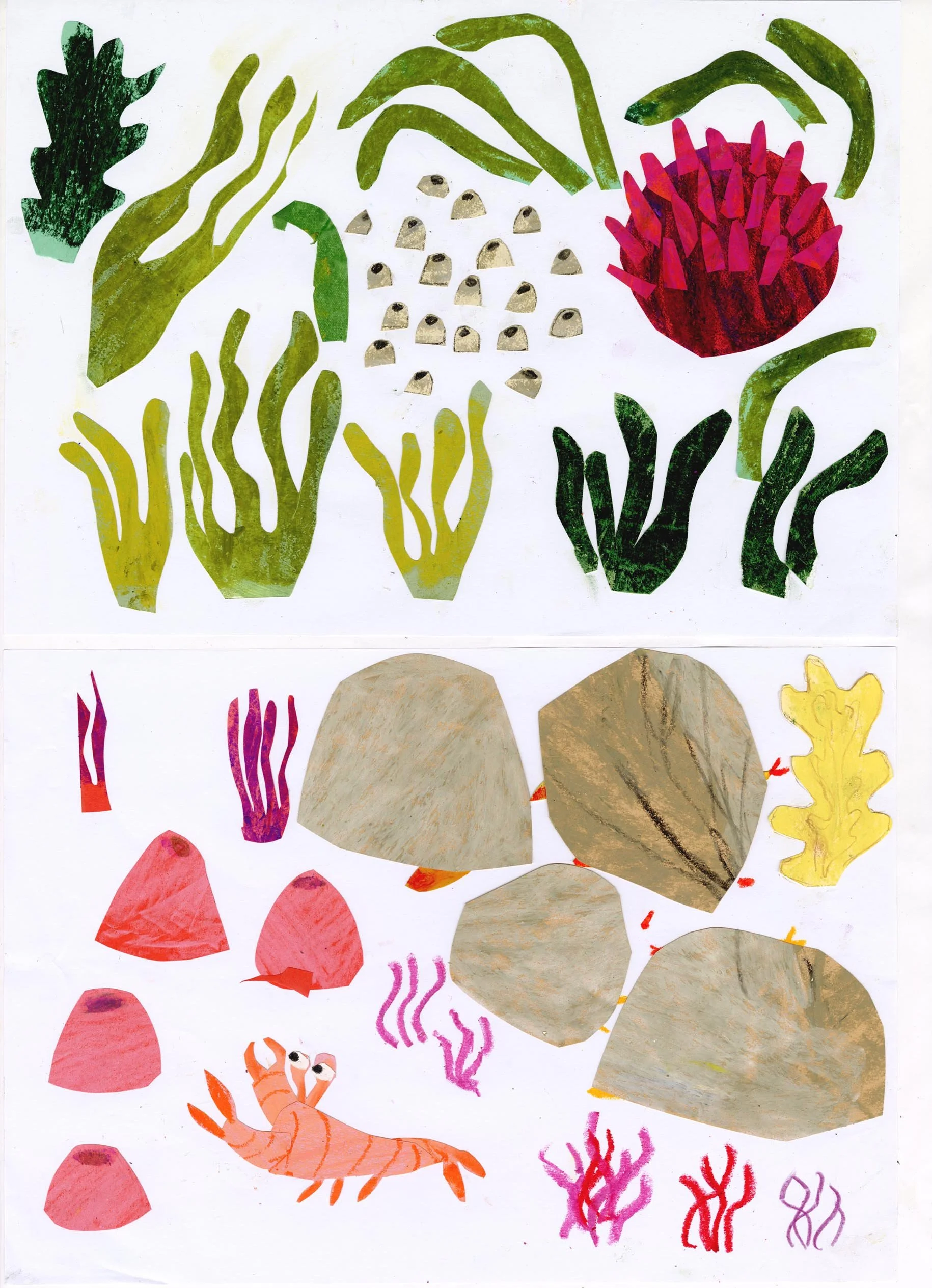
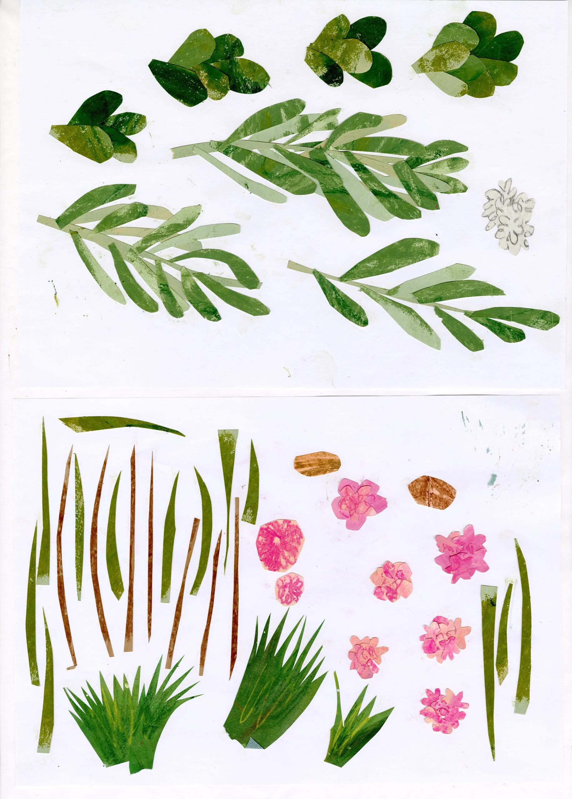
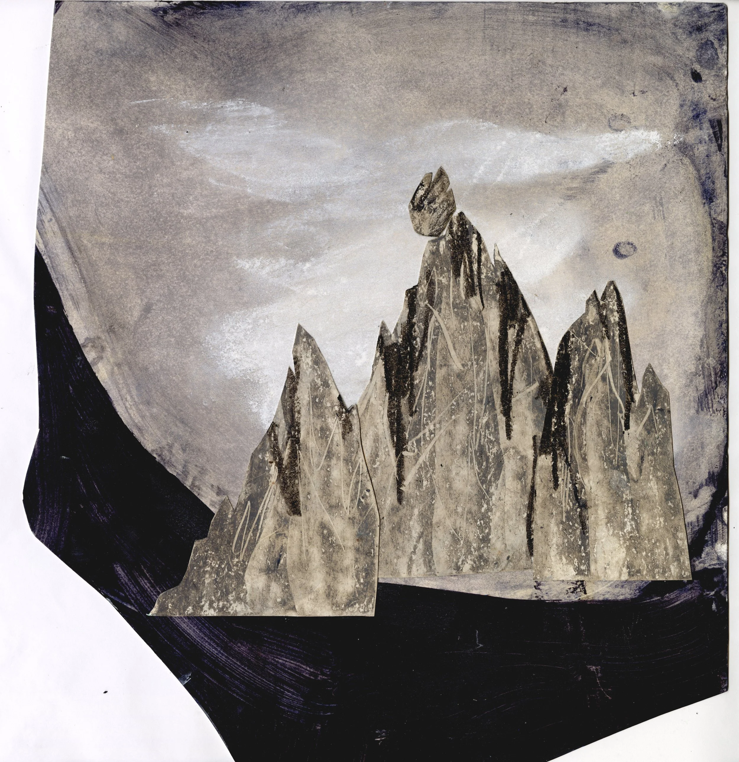
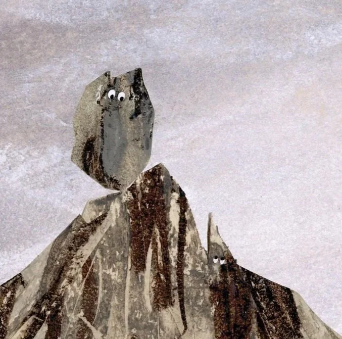
After scanning everything in I cut them out digitally and add them into the page, all in the correct dimensions and proportions etc. I also do them at the correct / print size. I actually love all the uneven edges, but they always get cut off due to the full bleed necessity of the picturebook page. ( Although maybe one day I will honour the edges in the composition).
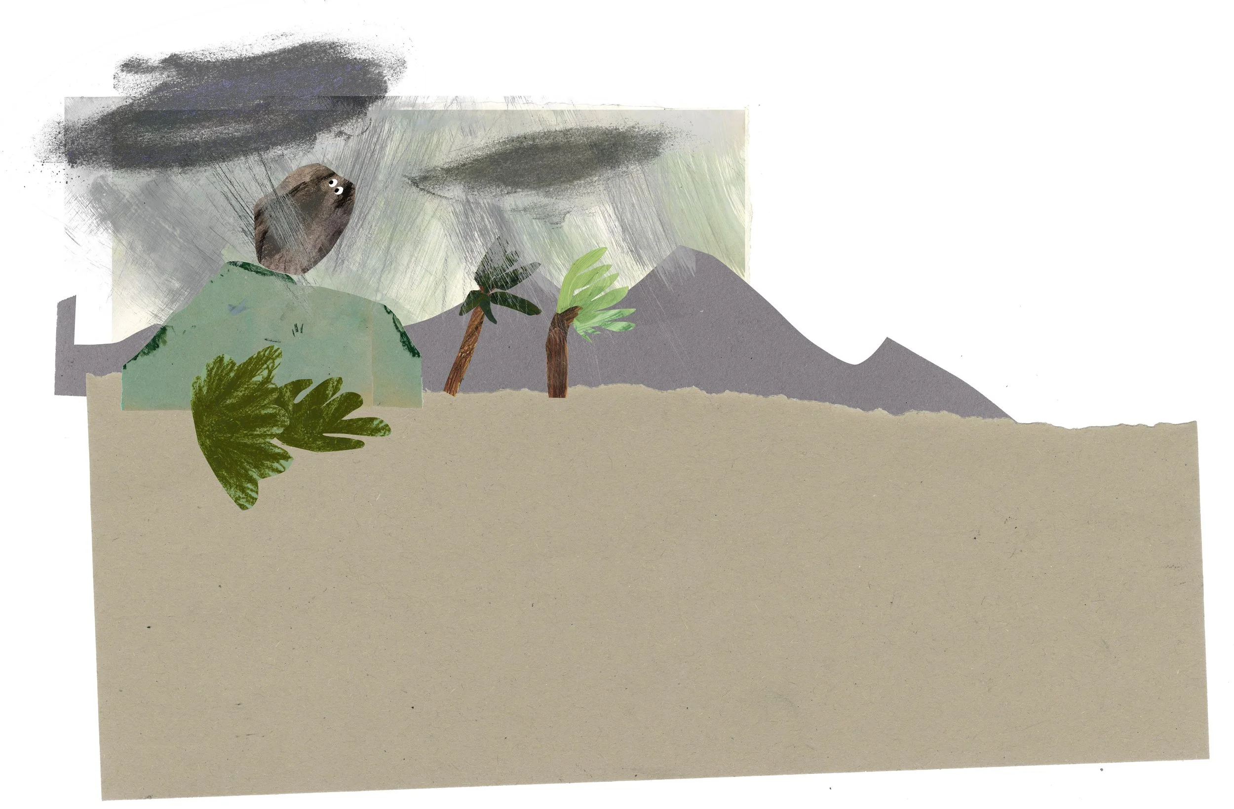
Composition process
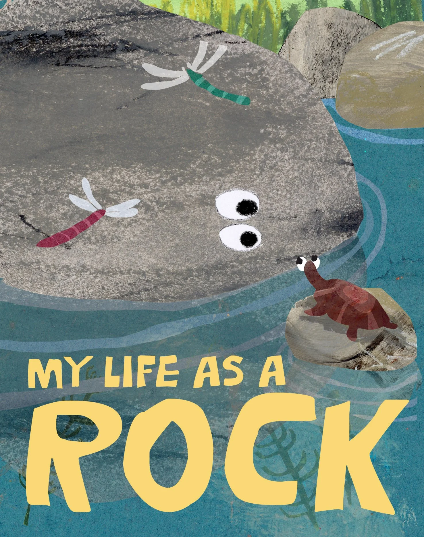
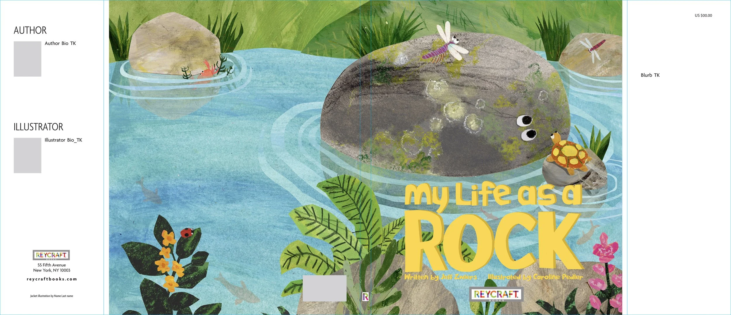
So then I would carry on and finish all the artworks, using indesign and their given template to place the artworks in place. I would also be working on the cover. I roughed a cover up digitally, as you can see the colours are dull, and then for the artwork brightening everything up.
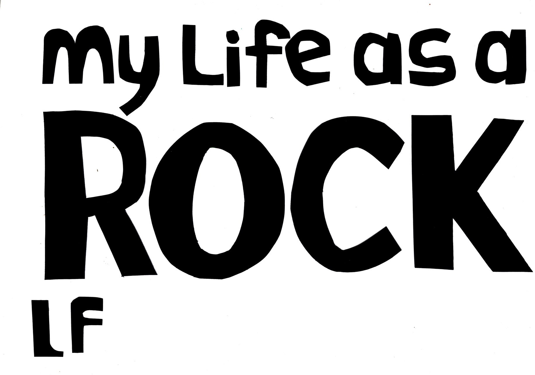
Given my time again I would like to change the cover a little, and the text, but the yellow worked at the time and gave enough brightness while giving space to the emotional connection of the characters.
I loved making this book and would love to bring my textures into more books. Maybe something with a little more space and long stretching vistas and emotional impact. Less eyes and more emotive composition.
I hope this is interesting to see. Please do leave any comments or Q’s you have below : )